
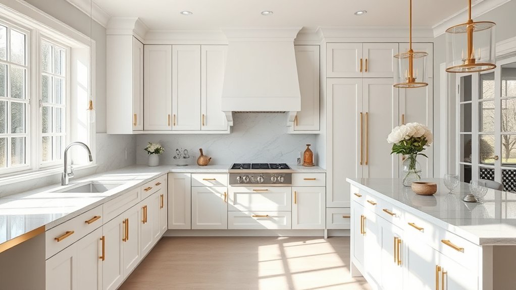
If by “most popular kitchen color” you mean wall paint, off-white is the clearest current answer for 2026. In the 2026 U.S. Houzz Kitchen Trends Study, 29% of renovating homeowners chose off-white walls, ahead of white at 21%. Cabinets tell a different story: wood finishes led at 29%, just ahead of white at 28%. That makes warm neutrals a strong starting point for walls, while wood, white, green, and blue can all work well depending on the surface, lighting, and fixed finishes.
Quick Answer
For 2026 U.S. kitchen renovations, off-white is the most popular wall color in Houzz data, chosen by 29% of surveyed homeowners. For cabinets, wood finishes lead at 29%, with white close behind at 28%. Warm off-whites, greiges, natural wood, muted greens, and deep blues remain versatile choices.
Key Takeaways
- Off-white leads kitchen wall colors in current Houzz renovation data, while natural wood leads cabinet finishes.
- There is no single “best” kitchen color for every home; lighting, countertops, flooring, backsplash, and cabinet undertones change how a color reads.
- For a timeless look, start with warm white, greige, taupe, or another flexible neutral, then add deeper blue or green in smaller doses if desired.
- Test paint in the actual kitchen from morning through evening before committing, and choose a sheen that matches the surface and cleaning needs.
What’s the Most Popular Kitchen Color?
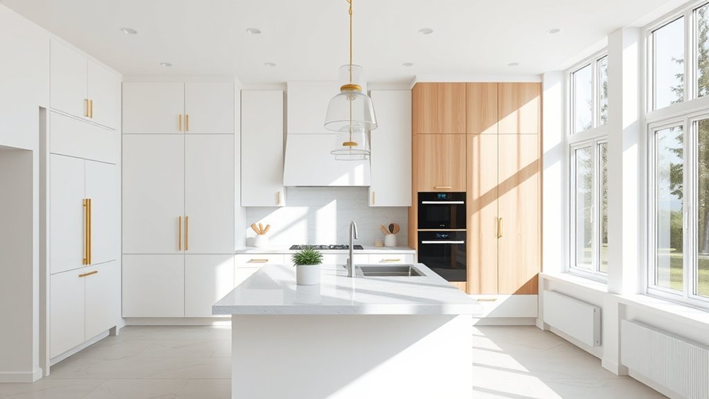
The most popular kitchen color depends on which surface you mean. For kitchen walls, current U.S. renovation data favors off-white. For cabinets, natural wood has moved slightly ahead of white. That distinction matters because broad claims such as “white is the most popular kitchen color” can be misleading when walls, cabinets, countertops, and backsplashes follow different patterns.
According to the 2026 U.S. Houzz Kitchen Trends Study findings, off-white was the leading kitchen wall color at 29%, followed by white at 21%, gray at 10%, and blue and beige at 7% each. For cabinets, wood finishes led at 29%, white followed at 28%, off-white reached 15%, green 6%, and gray 5%.
In 2026 Houzz renovation data, off-white leads kitchen walls at 29%, while wood finishes lead cabinets at 29%.
The survey covered 1,780 U.S. Houzz users who were homeowners and had recently completed, were working on, or planned to begin a kitchen renovation. It was fielded July 6–30, 2025 and published in January 2026, so the percentages describe that renovation population rather than every U.S. kitchen.
2026 Kitchen Color Trends by Surface
| Surface | Leading 2026 choices | What it means |
|---|---|---|
| Walls | Off-white 29%; white 21%; gray 10%; blue 7%; beige 7% | Warm, light neutrals remain the safest data-backed starting point. |
| Cabinets | Wood 29%; white 28%; off-white 15%; green 6%; gray 5% | Natural wood now edges out painted white in this renovation sample. |
| Countertops | White 37%; off-white 26%; black 9%; beige 7%; gray 7% | Light counters still dominate, so wall and cabinet colors should work with their undertones. |
| Backsplashes | White 31%; off-white 26%; beige 8%; gray 7%; blue 6% | Neutral backsplashes leave room for stronger cabinet or island color. |
All-white kitchens still have broad appeal, but current data also shows a shift toward warmer neutrals and natural wood. Muted greens and deep blues remain useful accent choices for homeowners who want more character without making every surface colorful.
Best Kitchen Paint Colors for a Timeless Look
Timeless kitchen paint colors usually start with warm off-whites, creams, greiges, and soft taupes because they coordinate with many cabinet woods, stones, metals, and backsplash materials. They are not automatically “trend-proof,” but they are easier to adapt when hardware, lighting, stools, or accessories change.
Benjamin Moore Pale Oak OC-20 is one example of a flexible neutral; Benjamin Moore describes it as a versatile shade with warm gray undertones. For a warmer white from Sherwin-Williams, Casa Blanca SW 7571 is the correct color name and number—not “Casablanca SW 7570.”
| Color direction | Why it lasts | Watch for |
|---|---|---|
| Pale Oak OC-20 | Warm gray undertone works with many woods and stones. | Can shift warmer or cooler as room light changes. |
| Casa Blanca SW 7571 | Warm white direction softens a kitchen without reading as stark. | Compare it directly with white counters and backsplash tile to avoid undertone clashes. |
| Earthy neutrals | Taupe, greige, and muted beige work well with wood, stone, and aged metals. | Very low-light rooms may make mid-tone neutrals look heavier. |
Soft whites can brighten a kitchen visually, but the exact result depends on window direction, bulb color temperature, surrounding finishes, and the paint’s undertone. A white that looks creamy in one kitchen can appear yellow or gray in another.
Pro Tip: Choose the wall color after identifying the undertones in your countertops, backsplash, flooring, and cabinet finish. A neutral that repeats or gently bridges those undertones usually looks more intentional than a color selected from a screen alone.
Kitchen Cabinet and Island Color Ideas
Current renovation data shows that natural wood and white dominate cabinet choices, while off-white, green, gray, blue, beige, black, and greige make up smaller shares. Painted navy, forest green, muted gray, and crisp white can still work beautifully; they are simply not all equally common in the 2026 Houzz sample.
Kitchen islands are a practical place to use a stronger color because they create contrast without requiring every cabinet to be dark. Benjamin Moore’s kitchen inspiration guidance highlights shades such as Oxford Gray, Aegean Teal, Tarrytown Green, Regent Green, and Kendall Charcoal for cabinets or islands.
Cabinet Color Favorites
For homeowners who want a lighter kitchen, white and off-white cabinets remain familiar choices. For a warmer, more organic look, medium and light wood tones are increasingly prominent. If more color is the goal, deep blues and muted greens can add character and definition without taking over the entire room.
Two-tone cabinetry can also work well. Houzz reports that among renovators using contrasting upper and lower cabinets, white is the leading upper-cabinet choice, while wood leads for lower cabinets; blue and green are also used on lowers. This supports a practical formula: keep the upper zone lighter, then add stronger color or wood lower in the room.
Statement Island Shades
A statement island can act as the kitchen’s visual anchor. Deeper shades such as Aegean Teal, Tarrytown Green, Oxford Gray, Regent Green, or deep navy can create contrast against light perimeter cabinets and counters.
- Use dark hues when you want the island to become a focal point.
- Navy and blue-gray pair easily with white, off-white, wood, and many metal finishes.
- Green works especially well with warm wood and natural stone.
- Keep surrounding surfaces quieter if the island color is strong.
Before committing, compare the island sample beside the actual countertop slab, flooring, and cabinet doors. A color that looks balanced on a small chip can feel much darker once it covers a large vertical surface.
Finish and Sheen Choices
Finish and sheen affect both appearance and maintenance. For cabinets, manufacturers commonly recommend durable cabinet or trim coatings in satin, semi-gloss, or gloss options. Sherwin-Williams, for example, lists satin, semi-gloss, and gloss versions of its cabinet-oriented urethane trim enamel.
For walls, there is no single required sheen. Semi-gloss is highly washable, while many modern satin, eggshell, low-lustre, and washable matte products can also work depending on the product line and the amount of splatter or scrubbing the wall receives. The Sherwin-Williams sheen guide notes that sheen changes both appearance and performance.
Higher sheen reflects more light and can make a color feel sharper or more vivid. Lower sheen reduces reflection and can make a deep color look softer, though performance depends on the specific paint formula. On a statement island, satin or semi-gloss often gives enough cleanability without creating mirror-like glare.
How to Pair Kitchen Colors for a Balanced Look
A balanced kitchen palette usually starts with one dominant color family, then adds a quieter supporting neutral and a smaller accent. The goal is not to follow a rigid formula; it is to keep the major fixed surfaces from competing with one another.
Choose a Dominant Hue
Your dominant hue might be an off-white wall color, natural wood cabinetry, a soft green, or a deeper blue. Start with the element that covers the most visual area or is hardest to change, such as cabinetry or flooring, and build outward from it.
- Use roughly 60% of the visible palette for the main color family if that proportion suits the room.
- Use about 30% for a supporting shade or material.
- Reserve about 10% for accents such as stools, lighting, hardware, art, or small painted areas.
- Treat the 60/30/10 idea as a design guideline, not a rule; fixed finishes may require different proportions.
This keeps the room composed while still leaving room for color and personality.
Balance With Neutrals
Soft white, cream, beige, taupe, greige, and warm gray can steady stronger cabinet or island colors. Charcoal can also act as a neutral when balanced with lighter counters or wood. Instead of matching every surface exactly, repeat a few related undertones so the kitchen feels connected.
Finish variation can add depth without adding more colors. For example, matte or eggshell walls, satin cabinets, and a slightly shinier trim can separate surfaces while keeping the palette restrained.
Add Accent Color Pops
Accent colors work best when they are small enough to change later. A bold tone such as Smoldering Red or Aegean Teal can energize a neutral kitchen, while muted greens such as October Mist can add softer contrast. More experimental pairings, such as Tropical Dusk with a pale yellow like Sundress, should be sampled carefully because surrounding light and finishes can change the balance dramatically.
- Place stronger color on an island, stools, a niche, open shelving back, or selected accessories.
- Repeat the accent once or twice elsewhere so it feels intentional.
- Keep expensive fixed surfaces more restrained if you like changing color often.
- Use color drenching only when you intentionally want walls, trim, and cabinetry to read as one continuous field.
Note: Paint-brand color names are useful examples, not guarantees. The same named shade can look noticeably different beside warm oak, cool quartz, cream tile, stainless steel, or under different bulbs.
Best Kitchen Colors for Small Kitchens
Light off-whites, whites, pale grays, and other light neutrals often help a small kitchen feel more open because they keep contrast low and reflect more available light. Benjamin Moore’s kitchen guidance similarly notes that lighter cabinet colors tend to make small spaces feel more open and spacious.
A creamy white or pale greige base can quiet the room, while muted greens or soft blues add character. Darker colors are not automatically wrong in a small kitchen; they simply create more contrast and visual weight. A deep island, lower cabinet run, or accent wall can work if the rest of the room has enough light and lighter surfaces.
A light base can visually open a compact kitchen, while one controlled darker accent adds depth without making every surface compete.
Reflective surfaces can also help distribute light, but very glossy paint may highlight wall or cabinet imperfections. In compact kitchens, a washable eggshell or satin wall finish and durable satin or semi-gloss cabinetry are often practical starting points, depending on the paint product.
How Paint Finishes Change Kitchen Color
Paint finish can change how a kitchen color appears because sheen affects reflected light. Sherwin-Williams notes that higher-gloss surfaces reflect light differently from flatter finishes, which can alter how a color is perceived.
On cabinets, satin can give a softer glow, while semi-gloss produces more reflection and can be easier to wipe clean. On walls, eggshell, low-lustre, satin, or washable matte may all be reasonable depending on the product and how much cleaning the surface needs.
- Choose a cabinet or trim enamel designed for hard, frequently touched surfaces.
- Use a wall paint rated for the room’s cleaning and moisture demands.
- Expect higher sheen to emphasize surface flaws more than flatter finishes.
- Test the actual color in or near the sheen you plan to use when possible.
How to Test Kitchen Paint Before You Commit
Color is strongly affected by natural light, artificial light, nearby materials, and sheen. Both Benjamin Moore and Sherwin-Williams recommend evaluating samples in the real room rather than relying only on a screen or small chip.
- Start with fixed finishes. Place paint samples beside the countertop, backsplash, floor, and cabinet door.
- Use a large sample. Paint a movable board or a generous wall area so you can judge the color at realistic scale.
- Check morning, afternoon, and night. View the sample under daylight and the kitchen’s normal artificial lighting.
- Move the sample around. A color may look different on a shaded wall than on a wall opposite a window.
- Confirm sheen. The final satin, eggshell, semi-gloss, or matte finish can change both reflection and perceived depth.
Pro Tip: Live with your top two or three samples for at least a full day of normal lighting conditions before choosing. A color that looks perfect at noon may shift noticeably under warm evening bulbs.
Frequently Asked Questions
What Are the Top 5 Kitchen Colors?
For kitchen walls in the 2026 U.S. Houzz renovation data, the top five reported choices are off-white (29%), white (21%), gray (10%), blue (7%), and beige (7%). That ranking applies to the surveyed U.S. renovating homeowners, not every kitchen or every surface.
What Is the Best Color for a Kitchen in 2026?
There is no universal best kitchen color. If you want a data-backed wall choice, off-white leads the 2026 Houzz renovation survey. If you want a 2026 trend neutral, Sherwin-Williams named Universal Khaki SW 6150 its 2026 Color of the Year, but that designation is not a ranking of kitchen colors.
What Color Should You Not Paint a Kitchen?
There is no single forbidden kitchen color. The bigger risk is choosing a shade that clashes with fixed undertones or becomes too dark, bright, or cold for the room’s light. Test bold black, neon, cool gray, or any highly saturated color in the actual kitchen before using it across large surfaces.
What Colors Make a Kitchen Look Expensive?
A polished, high-end look usually comes from coordination more than one “luxury” color. Warm off-white, taupe, greige, charcoal, navy, and deep green can all look refined when they work with the countertop, backsplash, wood tone, hardware, lighting, and sheen. Consistent undertones and well-finished surfaces matter more than chasing one expensive-looking shade.
Conclusion
For 2026, off-white is the most popular kitchen wall color in the best current U.S. renovation data cited here, while natural wood narrowly leads cabinet finishes. White still has major appeal, but it is no longer accurate to call it the single most popular choice across every kitchen surface. For a flexible design, begin with the room’s fixed materials and light, choose a warm neutral or coordinated color family, then use deeper green, blue, charcoal, or another accent where it adds purpose. Sampling the final color in the real kitchen is the most reliable way to avoid an undertone or lighting mismatch.
Sources
- 2026 U.S. Houzz Kitchen Trends Study — survey scope, methodology, and current U.S. kitchen renovation trends.
- Houzz: Kitchen Features Homeowners Are Choosing Right Now — wall, cabinet, countertop, and backsplash color percentages.
- Sherwin-Williams 2026 Color of the Year — verifies Universal Khaki SW 6150 and its 2026 designation.
- Sherwin-Williams Paint Sheen Guide — sheen, durability, reflectivity, and kitchen finish guidance.
- Benjamin Moore Kitchen Color Ideas & Inspiration — kitchen cabinet, island, neutral, blue, and green color guidance.
- Benjamin Moore: How to Use Paint Color Samples — testing colors under natural and artificial light.