
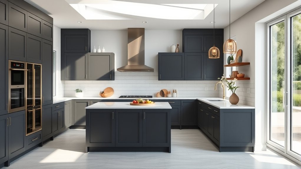
The best kitchen paint colors work with the room’s light, countertops, cabinets, flooring, and overall style rather than following one universal trend. Warm whites and beige create a flexible backdrop, sage and blue-gray add softer color, and deep navy, green, or wine tones can bring contrast to cabinets, islands, or selected walls. The key is matching undertones and testing the color in the actual kitchen before committing.
Quick Answer
Choose a kitchen paint color by matching its undertones to the countertops, cabinets, backsplash, and flooring, then test large samples through a full day of changing light. Warm whites and beige are versatile, sage and blue-gray add softness, while navy and deep green work well as controlled accents or cabinetry colors.
Key Takeaways
- Start with fixed materials such as countertops, backsplash, flooring, and unpainted cabinets before choosing a wall color.
- Warm whites, beige, khaki, sage, blue-gray, and deep blue are flexible kitchen color families, but the right choice depends on the room.
- For a small or dark kitchen, a lighter color can help the available light feel more prominent; Sherwin-Williams specifically recommends Alabaster SW 7008 as one option for smaller kitchens.
- Use deeper colors such as navy, forest green, or wine carefully on islands, cabinets, or feature areas when you want stronger contrast.
- Always test large samples in natural and artificial light before buying the full quantity of paint.
What Color Should You Paint a Kitchen?
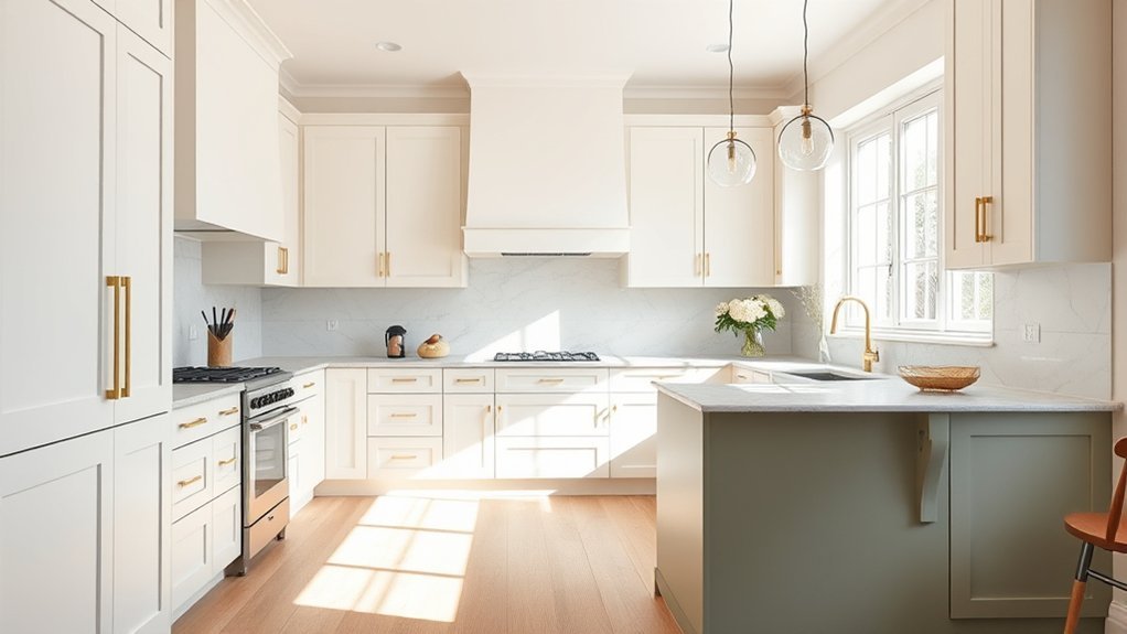
For most kitchens, the safest starting point is a color that relates to the materials that cannot easily be changed. Look at the undertones in the countertop, backsplash, flooring, cabinet finish, and nearby rooms before deciding whether the walls should lean warm, cool, light, or dark.
Soft white and creamy off-white work well when the kitchen already contains strong stone patterns, wood tones, or colorful cabinetry. Warm beige and greige add more depth without becoming a dominant feature. Muted green works naturally with wood and stone, while navy and deeper blue-gray can create deliberate contrast.
Bold reds and sunny yellows can also work, but they are easier to control as accents, furnishings, backsplash colors, or selected cabinetry rather than automatically covering every wall.
| Color Family | Works Well For | Watch For |
|---|---|---|
| Warm white / cream | Small kitchens, patterned stone, wood cabinetry, flexible backgrounds | Yellow or pink undertones that clash with cooler counters |
| Beige / khaki / greige | Warm woods, natural stone, transitional kitchens | Insufficient contrast with beige floors or counters |
| Sage / muted green | Farmhouse, organic, traditional, and nature-inspired schemes | Undertones that turn too yellow or gray beside existing finishes |
| Blue-gray / navy | Modern cabinetry, islands, crisp white counters, brass or nickel hardware | Darkening an already low-light room when used over large areas |
| Red / yellow / wine | Accent walls, islands, vintage schemes, decorative details | Visual intensity when used on every surface |
How Light and Undertones Affect Kitchen Paint Colors
A paint chip can look noticeably different after it reaches the wall because both natural and artificial light influence color. Benjamin Moore recommends evaluating samples at different times of day because changing light can alter how warm, cool, bright, or muted a color appears.
As a practical rule, north-facing rooms often receive cooler-looking light, while rooms with strong afternoon sun may make warm colors appear warmer. Artificial bulbs can change the appearance again at night. Instead of choosing a color solely from a phone screen or store display, evaluate it in the exact room where it will be used.
Undertones matter just as much. A gray may contain blue, green, violet, or beige undertones. A cream may lean yellow or pink. Those subtle differences become easier to see when the sample sits next to a large countertop, backsplash, floor, or cabinet door.
Pro Tip: Choose the paint color after the countertop, backsplash, flooring, and other expensive fixed finishes whenever possible. Paint is much easier and less expensive to adjust than stone, tile, or cabinetry.
Best Kitchen Colors by Style
The best kitchen colors by style depend on the architecture and materials already in the room rather than on a strict decorating formula.
Modern kitchens: Sleek gray, blue-gray, charcoal, and deep navy create clean contrast. Sherwin-Williams Naval SW 6244 is an example of a very dark navy that can work on cabinetry or an island when the surrounding finishes provide enough contrast.
Farmhouse kitchens: Warm whites, cream, muted sage, and softened green complement natural wood, stone, aged metals, and traditional cabinet profiles without requiring an all-white palette.
Traditional kitchens: Warm neutrals, off-whites, muted blue, and complex grays tend to sit comfortably beside detailed millwork. Benjamin Moore Pashmina AF-100 is a balanced neutral, while Oxford Gray 2128-40 provides a stronger blue-gray option.
Coastal kitchens: Soft blue, sea-glass green, sandy beige, cream, and restrained blue-gray support a lighter coastal palette without requiring literal nautical colors.
Minimalist kitchens: Warm whites and uncomplicated neutrals keep the material palette visually quiet. Sherwin-Williams Alabaster SW 7008 is a light warm white, while Whisper SW 9591 is a noticeably deeper warm beige rather than a substitute for a bright white.
Best Kitchen Paint Colors for 2026
There is no single objectively best kitchen color for 2026, but current manufacturer forecasts provide useful direction. Sherwin-Williams selected Universal Khaki SW 6150 as its 2026 Color of the Year, describing it as a warm, foundational mid-tone neutral.
The company’s broader 2026 Colormix forecast includes frosted tints, sunbaked hues, restorative darks, and foundational neutrals. For kitchens, that points toward several practical directions rather than one mandatory color:
- Warm khaki and beige: useful with oak, walnut, cream stone, and other warm natural finishes.
- Soft tints: useful where a lighter and quieter wall color is preferred.
- Deep restorative colors: suitable for islands, cabinetry, pantries, or other focal areas when the room has enough visual balance.
- Warm white: still useful as a flexible backdrop even when it is not the headline trend color.
- Earthy green and blue-gray: practical alternatives for homeowners who want more color without moving into very saturated hues.
A 2026 kitchen does not need to follow one “color of the year.” The stronger approach is to use current color directions only when they coordinate with the room’s permanent materials and lighting.
Kitchen Paint Ideas for Small Spaces
Small kitchens often benefit from lighter wall colors when the goal is to make the available daylight and artificial light feel more prominent. That does not mean every compact kitchen has to be white, but highly reflective or very light colors generally create less visual weight than deep wall colors.
Sherwin-Williams specifically recommends bright, creamy Alabaster SW 7008 as one option for opening up a smaller kitchen. Its official color data places it firmly in the light range.
Whisper SW 9591 is also featured by Sherwin-Williams for kitchens, but it is a warmer beige and creates a more grounded look than Alabaster. It can work well when the room has adequate light or when a stark white would clash with warm flooring, stone, or cabinetry.
Soft pastel hues, including restrained pinks, pale greens, and light blue-grays, can also work in compact kitchens when their undertones coordinate with the existing finishes.
For stronger definition, a deep color such as Benjamin Moore Hunter Green 2041-10 or Vintage Wine 2116-20 can be used selectively rather than automatically covering every wall. A dark island, pantry cabinet, or short accent area often provides sufficient contrast.
Note: A light paint color can change the perceived brightness of a kitchen, but it cannot compensate for poor lighting, blocked windows, or an inadequate lighting plan. Evaluate paint together with the room’s actual light sources.
Cabinet and Kitchen Island Color Ideas
Cabinet and island colors have more visual weight than a small wall sample, so they should connect clearly with countertops, backsplash, flooring, and hardware.
For a cooler scheme, sapphire blue or Benjamin Moore Oxford Gray 2128-40, a blue-gray, can add depth without using pure black.
For a green focal point, Benjamin Moore Tarrytown Green HC-134 is a deep pine green with a cool cast. Aegean Teal 2136-40 is a softer blue-green with gray in it. Either can distinguish an island from lighter perimeter cabinets, provided the countertop and backsplash undertones cooperate.
A cohesive two-tone kitchen usually works best when one surface acts as the dominant neutral and the second color appears in a controlled area. For example:
- warm-white perimeter cabinets with a navy island;
- cream walls with sage cabinetry;
- wood lower cabinets with warm-white upper cabinets;
- soft greige cabinets with a deep green island;
- blue-gray cabinets beside a simple warm or neutral wall color.
Finish matters as well as color. A cabinet coating needs to tolerate frequent handling and cleaning. Sherwin-Williams Emerald Urethane Trim Enamel, for example, is formulated for doors and trim, offers a hard durable finish, and is described by the manufacturer as resisting yellowing compared with traditional oil-based coatings.
What Paint Finish Is Best for a Kitchen?
Choose the paint finish according to the surface and the specific paint product rather than selecting the glossiest option simply to reflect more light.
- Kitchen walls: washable eggshell, satin, low-lustre, or semi-gloss products can all be appropriate depending on the manufacturer’s system and how much cleaning the walls receive.
- Trim and doors: semi-gloss or other durable trim finishes are common because they tolerate cleaning and visually separate trim from walls.
- Cabinets: use a coating specifically rated for cabinetry, doors, trim, or similarly hard-working surfaces rather than ordinary flat wall paint.
- Ceilings: a flatter finish is commonly used where hiding surface imperfections and limiting glare are priorities.
Sherwin-Williams’ current paint sheen guide lists semi-gloss as a kitchen option and describes satin/eg-shel finishes as washable choices suited to high-traffic spaces. Always check the instructions for the exact product being applied because performance varies by paint line.
How to Test Kitchen Paint Colors
A kitchen color should be judged in the room where it will actually be used. Natural daylight, evening light, under-cabinet fixtures, ceiling lights, countertops, flooring, and cabinetry can all change how a sample appears.
Test kitchen colors in changing light and beside the permanent finishes before committing to the full room.
- Narrow the choice to a few colors. Comparing three or four serious candidates is easier than covering the wall with many unrelated samples.
- Create a large sample. Brush the sample onto the wall or a large movable white sample board. Benjamin Moore recommends a large sample area and suggests two coats for a more representative color test.
- Move the sample around. Check it beside cabinets, countertops, flooring, backsplash, appliances, and trim.
- Observe it throughout the day. Look in morning, afternoon, evening, and artificial light rather than making the decision immediately after application.
- Compare undertones. Watch for unwanted pink, yellow, green, blue, or violet casts that only become obvious beside fixed materials.
- Confirm the final product and sheen. Sample appearance can vary with finish and product formulation, so review the manufacturer’s instructions before purchasing the final paint.
Benjamin Moore specifically recommends testing colors from morning to evening under both natural and artificial light and suggests movable foam-core boards as one sampling method. Sherwin-Williams likewise recommends sampling color in the intended environment so lighting and surrounding elements can be evaluated.
Common Kitchen Paint Color Mistakes
- Choosing from a screen alone: monitors and phones cannot reliably reproduce the final painted color.
- Ignoring undertones: two colors that look neutral independently may clash when placed together.
- Selecting wall paint before expensive finishes: it is usually easier to match paint to stone and tile than to find stone and tile that perfectly match a preselected paint color.
- Testing only one small chip: larger samples make undertones and brightness easier to judge.
- Viewing the sample at only one time of day: a color that works in daylight may look noticeably different under evening bulbs.
- Using too many statement colors: a strong wall, colorful cabinets, bold backsplash, patterned counter, and contrasting island can compete for attention when none is allowed to lead.
- Assuming a trend guarantees longevity: current colors can provide inspiration, but permanent materials and personal preference should have more influence than a yearly forecast.
Frequently Asked Questions
What Is the Best Color to Paint a Kitchen?
There is no single best kitchen color for every home. Warm white is one of the most flexible choices, but beige, greige, sage, blue-gray, navy, and other muted colors can work equally well when their undertones coordinate with the countertops, cabinets, backsplash, flooring, and light.
What Is Joanna Gaines’ Favorite Kitchen Color?
There is no reliable current Magnolia source establishing one single kitchen color as Joanna Gaines’ universal favorite. Magnolia project sourcebooks show her using several whites, creams, neutrals, greens, grays, and contrasting cabinet colors. Documented kitchen examples include Silos White, Castle Cream, Blanched, Plaster, Cottage Grove, and other shades, so describing Sherwin-Williams Alabaster as her definitive favorite is too strong.
What Is the Best Color for a Kitchen in 2026?
No one color is objectively best for every 2026 kitchen. Sherwin-Williams selected Universal Khaki SW 6150 as its 2026 Color of the Year, while its broader forecast includes warm foundational neutrals, soft tints, sunbaked colors, and darker restorative shades. Warm beige, khaki, creamy white, muted green, and selected deeper accents all fit current directions when they suit the room’s permanent finishes.
What Are the Top Five Kitchen Colors?
A practical shortlist is warm white, warm beige or khaki, sage or muted olive, blue-gray, and navy or another deep blue. Sunny yellow can also work well as an accent when more energy is wanted. The best five for a particular kitchen depend on the light and existing countertops, cabinets, backsplash, and flooring.
Should Kitchen Walls Be Lighter Than the Cabinets?
Not necessarily. Lighter walls with darker cabinets create clear contrast and can help a compact kitchen feel less visually heavy, but darker walls can work with light cabinetry in a well-lit room. Aim for enough contrast that the cabinets, walls, countertop, and backsplash remain visually distinct.
What Paint Finish Is Best for Kitchen Walls?
A washable finish is usually the priority. Depending on the paint line, eggshell, satin, low-lustre, or semi-gloss may be suitable. Semi-gloss is easier to wipe in many product systems but also reflects more light and can emphasize wall imperfections. Follow the sheen guidance for the exact paint product you choose.
Conclusion
Choosing the right kitchen color is less about finding one universally perfect shade and more about creating a palette that works with the room you already have. Start with the fixed finishes, decide whether their undertones are warm or cool, consider how much natural and artificial light the kitchen receives, and then narrow the palette to a few coordinated colors.
Warm whites and lighter neutrals remain useful when brightness and flexibility are priorities. Beige, khaki, sage, blue-gray, navy, Hunter Green, Vintage Wine, and other deeper shades can add character when used in the right proportion. Cabinets and islands provide additional opportunities for contrast without requiring every wall to become a statement.
Most importantly, test the final candidates in the actual kitchen. A thoughtful sample viewed beside the cabinets, countertop, flooring, and backsplash from morning through evening provides far more useful information than a trend list or digital swatch alone.
Sources
- Sherwin-Williams Kitchen Paint Colors — backs the kitchen recommendations for Whisper SW 9591 and Alabaster SW 7008.
- Sherwin-Williams 2026 Color of the Year — verifies Universal Khaki SW 6150 and the company’s 2026 warm-neutral direction.
- Sherwin-Williams Paint Sheen Guide — supports kitchen, trim, satin/eg-shel, and semi-gloss finish guidance.
- Benjamin Moore Paint Color Sample Guide — supports using large samples, movable sample boards, multiple coats, and evaluating color in changing light.
- Magnolia: The Castle Kitchen and Dining — provides documented examples of kitchen colors used in a Joanna Gaines-designed project.