
For kitchens with white cabinets, the most reliable wall colors are warm greiges, soft beiges, muted greens, gentle blues, and other restrained neutrals that complement the cabinet undertone. Dark green, navy, charcoal, and even black can also work when stronger contrast is wanted. Before choosing a color, compare it with the cabinets, countertops, backsplash, flooring, and actual kitchen lighting.
Quick Answer
The best wall color for white kitchen cabinets depends on the cabinet undertone. Warm whites pair naturally with warm greige, beige, sage, and earthy colors, while cooler whites work well with blue-gray, muted blue, and cooler greens. Neutral whites are more flexible. Always test the wall color beside the cabinets and fixed finishes before buying full gallons.
Key Takeaways
- Match the wall paint to the undertone of the white cabinets, not simply to the word “white.”
- Warm greige, beige, sage, muted blue, and soft off-white are versatile starting points.
- Dark green, navy, charcoal, or black can create attractive contrast when the room has enough visual balance.
- Countertops, backsplash, flooring, hardware, and lighting should be considered before making the final choice.
- Use a physical sample and check it in morning, afternoon, and evening light before committing.
How to Pick Wall Colors for White Cabinets
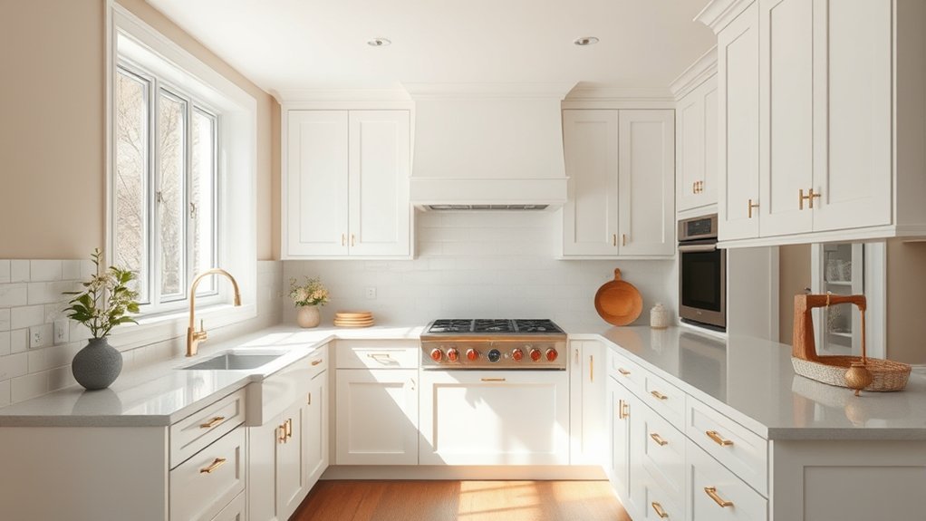
Start with the exact white used on the cabinets. Some whites lean creamy, beige, or yellow; others lean gray, blue, or cooler. A wall color that looks attractive by itself can look unexpectedly pink, green, yellow, or gray when placed beside a different white undertone.
Next, look at the kitchen’s permanent finishes. Countertops, backsplash tile, flooring, appliances, and hardware usually cost more to change than wall paint, so the wall color should connect those materials rather than compete with them.
- Warm white or creamy cabinets: try warm greige, beige, taupe, muted olive, sage, or other earthy tones.
- Cool white cabinets: consider blue-gray, muted blue, gray-green, or a cleaner neutral.
- Neutral white cabinets: both warm and cool palettes can work, making the countertop and flooring especially important tie-breakers.
A traditional color wheel can help when building a broader palette, but undertones and fixed finishes are more useful than choosing a wall color solely because it is technically complementary.
Pro Tip: Hold the wall sample directly beside a cabinet door, countertop, backsplash, and floor sample. If one fixed finish suddenly looks unusually pink, yellow, green, or gray, the undertones may be fighting each other.
Match the Wall Color to the Cabinet Undertone
White paint is rarely completely neutral. Two paints that both appear white on a color card can look noticeably different when placed side by side. This is why matching undertones matters more than simply choosing a popular paint name.
| Cabinet Appearance | Wall Colors to Try | Watch For |
|---|---|---|
| Creamy or warm white | Warm greige, beige, taupe, sage, muted olive | Very icy gray or blue may make the cabinets look more yellow |
| Cool or blue-white | Blue-gray, muted blue, cool green, balanced gray | Creamy wall whites may appear dingy beside a crisp cabinet white |
| Balanced or neutral white | Greige, sage, blue, beige, charcoal, or another white | Let countertops and flooring determine whether warm or cool works better |
Best Warm Neutrals for White Cabinets
Warm neutrals soften the crisp appearance of white cabinets while keeping the room flexible enough for changing hardware, furniture, and accessories. Shoji White, Urban Putty, Ballet White, and Agreeable Gray are useful examples, but they vary considerably in depth.
| Shade | Approx. LRV | General Effect |
|---|---|---|
| Sherwin-Williams Shoji White SW 7042 | 74 | Soft warm white with creamy, greige influence |
| Sherwin-Williams Urban Putty SW 7532 | 54 | Deeper earthy neutral with more visible contrast |
| Benjamin Moore Ballet White OC-9 | 72 | Light off-white that adds gentle separation from bright white cabinetry |
| Sherwin-Williams Agreeable Gray SW 7029 | 60 | Warm gray with a beige undertone |
LRV, or Light Reflectance Value, indicates how much visible light a painted surface reflects on a scale commonly expressed from 0 to 100. A higher LRV generally means a lighter-looking color, while a lower LRV creates more depth. LRV is useful for comparing colors, but it cannot predict exactly how a paint will look in a particular kitchen.
Note: A warm neutral does not automatically prevent white cabinets from looking yellow. If the cabinet white and wall paint have conflicting undertones, either color can make the other look warmer or cooler than expected.
Soft Colors That Keep Kitchens Calm
Sage green, muted blue, pale blue, warm gray, and dusty pink can add color without competing heavily with white cabinetry. These hues are particularly useful when the kitchen already contains wood, stone, or other natural-looking materials.
The goal is not simply to choose the palest color available. A slightly grayed or muted color often connects more easily with countertops and flooring than a highly saturated pastel.
Serene Pastel Pairings
Sage and gray-green shades can create an understated bridge between white cabinets and warm wood or stone. Farrow & Ball Mizzle No. 266, for example, is a pale green-gray that provides more color than an off-white without becoming dominant.
For a breezier blue, Behr Dayflower MQ3-54 is officially described as a light dusty blue. It can work beside white cabinets when the countertops and backsplash also support blue or gray notes.
Sherwin-Williams Honeypot SW 9663 provides a soft yellow direction for homeowners who want more warmth. Yellow is strongly influenced by both daylight and artificial bulbs, so a physical sample is especially important.
Dusty pink can also work with white cabinetry when the rest of the room contains warm metals, warm stone, wood, or earthy accents. Farrow & Ball Sulking Room Pink No. 295 is a muted alternative to a clear pastel pink.
For a deeper muted blue, Valspar’s Cottage Door is described by the manufacturer as a grayed-out blue. It can provide more definition than a very pale blue while still remaining softer than navy.
Gentle Hues for Calm
The easiest way to compare these softer colors is by deciding how much contrast is wanted. Sage green creates a natural connection with wood and stone. Muted blue supplies cooler contrast. Pastel blue keeps the overall palette light, while warm gray stays closer to a neutral scheme.
Dusty pink is more distinctive but can still read as restrained when its saturation is low. None of these colors automatically makes a small kitchen look larger; wall area, cabinetry, daylight, contrast, and furnishings all influence the final perception of space.
Bold Wall Colors That Add Contrast
White cabinets also make a useful backdrop for stronger wall colors. Dark green, navy, charcoal, black, teal, and even orange can work when they connect with another element in the room and are used at an appropriate scale.
In the 2026 U.S. Houzz Kitchen Trends Study, wood cabinets narrowly moved ahead of white, 29% to 28%, but white remained one of the two most common choices among renovating homeowners.
Current trends also lean toward natural and restrained palettes. The NKBA 2026 Kitchen Trends Report found especially strong professional interest in neutrals, greens, blues, and natural materials. That does not mean a bright color is wrong; it simply makes bold orange or teal a more individual design choice rather than a universal default.
- Bright orange: energetic and warm; often easiest to control on a smaller wall or targeted accent area.
- Dark green: rich contrast that works particularly well with wood, brass, black, and warm stone.
- Bright teal: lively and distinctive; repeat it in a smaller accessory or pattern so it feels intentional.
- Muted blue: offers noticeable contrast without the visual weight of very dark paint.
- Pure black or charcoal: provides strong architectural contrast, especially when the room has adequate light and other lighter surfaces.
In smaller kitchens, a deep color can still work successfully. The key is deciding whether the goal is an airy effect or a more enclosed, dramatic one rather than assuming dark paint must always be avoided.
Can You Use White Walls With White Cabinets?
Yes. A white-on-white kitchen can look clean and cohesive, but the whites should be compared side by side. Two similar whites with conflicting undertones can make one surface look unexpectedly yellow, gray, pink, or blue.
For the safest white-on-white approach, use the same paint color in different appropriate finishes, or choose two whites that clearly share the same undertone family. Texture then becomes important: backsplash tile, wood flooring, stone counters, metal hardware, fabrics, and lighting prevent the room from looking flat.
A wall white can also be deliberately softer than the cabinet white. The difference should look intentional enough that it does not appear to be an unsuccessful color match.
How to Test Paint in Kitchen Light
Paint should be evaluated in the actual kitchen rather than selected only from an online image or a small store chip. Computer and phone displays cannot reproduce paint color reliably, and real rooms change throughout the day.
Benjamin Moore’s sampling guidance specifically recommends evaluating color in the space and under changing light.
Observe Sample Colors
- Shortlist two to four colors rather than comparing a large stack of nearly identical samples.
- Use a large painted sample board, peel-and-stick sample, or adequately sized test area.
- Place each sample directly beside the white cabinets.
- Move it near the countertop, backsplash, floor, and major appliance finishes.
- Check it on more than one wall because different walls receive different light.
- Photograph the samples for reference, but make the final decision from the physical samples rather than the photo alone.
Check Day and Night
View each sample in morning daylight, stronger daytime light, late afternoon, and after dark with the kitchen lights switched on. A color that appears balanced at noon can look much warmer, cooler, lighter, or deeper at night.
Window direction also matters. In much of the Northern Hemisphere, north-facing windows tend to provide cooler, more indirect light while south-facing rooms often receive stronger sunlight. Conditions vary by latitude, season, weather, window size, landscaping, and the surrounding buildings, so the actual room should always be the final test.
Pro Tip: Leave the final two samples in place for at least a full day of normal use. Look at them while the room is lit the way it normally is for breakfast, cooking, and evening cleanup.
Choose a Kitchen-Friendly Paint Sheen
Color is only part of the decision. Kitchen walls are exposed to fingerprints, food splashes, moisture, and repeated cleaning, so the paint product and sheen should suit the location.
Manufacturer recommendations vary. Behr recommends satin for moderate- to high-traffic areas and spaces with some moisture exposure, including kitchens and bathrooms. Sherwin-Williams also emphasizes more durable, washable finishes for high-traffic or moisture-prone areas and lists semi-gloss as a kitchen option.
For many homes, a washable eggshell or satin wall paint offers a practical balance between low glare and cleanability. Semi-gloss reflects more light and can be easier to wipe, but it also makes surface imperfections more noticeable. Always follow the specific paint manufacturer’s recommendations because modern formulas differ considerably.
Match Wall Color to Your Kitchen Style
The same white cabinetry can support very different looks depending on the wall color and surrounding materials. Instead of choosing a shade because it has been labeled “modern” or “farmhouse,” use the style as a starting point and then verify that the undertones work with the actual room.
| Kitchen Style | Wall Colors to Consider | Useful Pairings |
|---|---|---|
| Modern | Pale gray, greige, charcoal, black, muted green | Black hardware, slab surfaces, simple lighting |
| Transitional | Warm greige, soft beige, sage, blue-gray | Mixed metals, stone counters, medium-tone wood |
| Traditional | Creamy off-white, beige, muted green, deeper blue | Warm wood, detailed trim, classic hardware |
| Farmhouse | Warm white, greige, muted blue, sage | Natural wood, aged metals, textured surfaces |
| Coastal | Pale blue, blue-green, soft warm white, light greige | Light wood, woven textures, restrained metallic accents |
Light blue can make a white kitchen feel softer, while pale gray provides subtle separation. Muted greens connect naturally with wood and stone. Off-white and warm beige add warmth, and a controlled soft yellow can brighten a palette that otherwise feels too cool.
Rather than forcing the kitchen into a category, choose the combination that works with the cabinetry, architecture, fixed finishes, and the amount of contrast you want to see every day.
Frequently Asked Questions
Are White Cabinets Out of Style in 2026?
No. White cabinets remain widely used, although they are no longer the clear leader in every trend study. The 2026 U.S. Houzz Kitchen Trends Study found wood cabinets at 29% among renovating homeowners and white at 28%. NKBA’s 2026 research also points toward growing interest in natural materials while showing that neutral palettes remain important. White cabinetry is therefore still current, but homeowners have more competition from wood and warmer natural finishes than in previous years.
What Is Joanna Gaines’ Favorite Kitchen Color?
There is no reliable current Magnolia source establishing Repose Gray, Alabaster, or another single shade as Joanna Gaines’ permanent favorite kitchen color. Magnolia Home by Joanna Gaines includes many warm whites, grays, beiges, greens, and other colors. For example, Magnolia describes Gatherings as a golden gray with amber and tan undertones. It is better to choose from her verified palettes based on the room rather than rely on an attributed “favorite.”
Should Walls Be Lighter or Darker Than Kitchen Cabinets?
Either can work. With white cabinets, a medium or dark wall color creates clearer contrast, while another white or pale neutral produces a softer, more continuous look. There is no rule requiring the walls to be lighter than the cabinetry. Undertones, room light, wall area, countertops, flooring, and the desired amount of contrast are more important.
How Do You Warm Up a Kitchen With White Cabinets?
Add warm wall colors such as greige, beige, taupe, muted green, or a creamy off-white, then repeat warmth through natural wood, woven textures, brass or aged-metal accents, warm-toned stone, terracotta, and appropriately warm lighting. Layering several materials usually looks more natural than relying on one warm paint color alone.
What Wall Color Makes White Cabinets Look Less Stark?
Warm greige, beige, taupe, sage, muted olive, dusty blue, and other softened colors can reduce the visual contrast associated with crisp white cabinets. The best option is one whose undertone also connects with the countertop, backsplash, and flooring.
Can You Use White Walls With White Kitchen Cabinets?
Yes. White walls and white cabinets can create a cohesive kitchen when their undertones coordinate. Using the same color in different appropriate finishes is one simple approach. If two different whites are used, compare them directly so one does not make the other appear unexpectedly yellow, gray, pink, or blue.
Conclusion
The best kitchen wall color for white cabinets is the one that connects the cabinet undertone with the countertops, backsplash, flooring, and light in the room. Warm greige, beige, sage, muted blue, and soft off-white are versatile choices, while dark green, navy, charcoal, and black can provide stronger contrast.
Do not choose from a screen or trend list alone. Narrow the options, compare large physical samples beside the cabinets and fixed finishes, and view them throughout the day. That simple process is far more reliable than trying to find one universally perfect color for every white kitchen.
Sources
- Sherwin-Williams — Shoji White SW 7042 — verifies the color and manufacturer specifications used in the warm-neutral comparison.
- Sherwin-Williams — Urban Putty SW 7532 — verifies Urban Putty’s current LRV and color data.
- Benjamin Moore — Ballet White OC-9 — verifies Ballet White’s classification and LRV.
- Houzz — 2026 U.S. Kitchen Trends Study findings — supports the current comparison of white and wood cabinet popularity.
- National Kitchen & Bath Association — 2026 Kitchen Trends Report — supports current kitchen color, material, and natural-finish trends.
- Magnolia Home by Joanna Gaines — Gatherings — provides a verified example from the current Magnolia Home paint collection.

2 thoughts on “What Color to Paint Kitchen With White Cabinets? Best Ideas & Tips”