
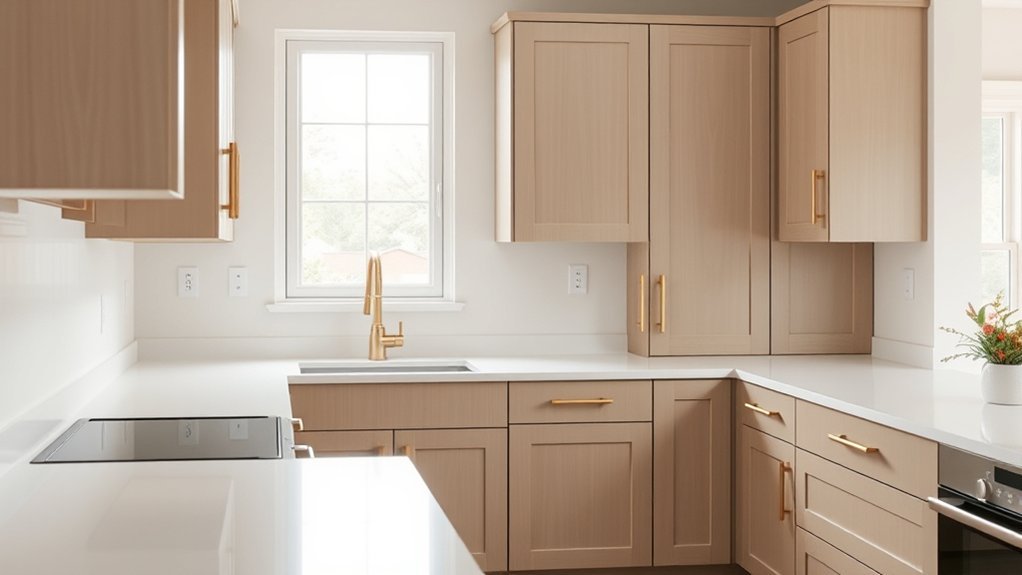
The most reliable way to identify an existing kitchen cabinet color is to combine documentation with physical comparison. First check for a manufacturer label, leftover paint, an invoice, or an original color code. If none exists, clean the cabinet, study it in several lighting conditions, identify its undertone and sheen, and compare physical paint samples directly against the door. A phone app can narrow the options, but a dried sample or controlled-light color match is more dependable for a final decision.
Quick Answer
To identify your kitchen cabinet color, first look for a paint code, manufacturer label, leftover can, or renovation record. If you cannot find one, clean a cabinet door and compare physical swatches against it in daylight and evening light. Match the undertone and sheen separately, then confirm the closest choice with a dried test sample.
Key Takeaways
- Check labels, leftover paint, invoices, and manufacturer records before trying to identify the color visually.
- Clean the cabinet first because grease, smoke, dust, and age can change how the finish appears.
- Compare physical samples in several lighting conditions rather than relying on a photograph or phone screen.
- Match both the color and the sheen; identical colors can look noticeably different in matte, satin, semi-gloss, or gloss finishes.
- Use apps to narrow the search, then confirm the result with a dried sample or professional color-matching tool.
At a Glance
| Time Required | About 30–90 minutes for an initial match, plus drying time for any test paint |
| Difficulty | Easy to moderate |
| Tools Needed | White paper, physical paint swatches, microfiber cloth, phone camera, and optional paint sample or color scanner |
| Cost | Potentially free with existing records and color chips; paint samples or dedicated matching tools add cost |
Start With Natural Light
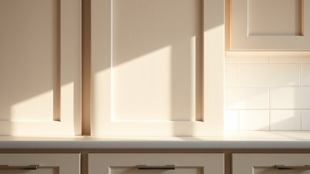
Natural light should be one of the first tools used when evaluating cabinet color. The same finish can look warmer, cooler, lighter, or grayer as the direction and strength of the light changes through the day.
North-facing rooms generally receive cooler-looking natural light, while south-facing rooms tend to receive stronger, warmer light. East- and west-facing rooms can change more noticeably throughout the day because the strongest direct light arrives at different times.
Do not try to name the color from one glance. Hold the same swatch beside the cabinet in the morning, afternoon, and evening. Also view it with the kitchen lights switched on because the color temperature of the bulbs can change the apparent undertone.
Darker colors usually reflect less light than pale colors, but brightness alone does not identify the paint. Concentrate on whether the cabinet shifts toward yellow, cream, pink, red, green, blue, or gray under different conditions.
Window treatments, countertops, backsplashes, flooring, and wall colors can also cast reflected color onto the cabinet. Looking at more than one door and more than one part of the room helps prevent a misleading comparison.
Note: Never identify an exact cabinet paint color from a phone photograph alone. Automatic exposure, white balance, room lighting, and the display itself can all change the color you see.
Check for a Label or Original Paint Record First
Before comparing dozens of paint chips, look for evidence of the original finish. A documented color name or code is usually a better starting point than a visual guess.
- Look inside cabinet doors and drawer boxes for manufacturer labels or order stickers.
- Check underneath shelves, sink cabinets, or removable drawers for handwritten finish codes.
- Search renovation invoices, builder selections, design documents, and purchase emails.
- Look for leftover paint or stain stored in a garage, basement, utility room, or closet.
- If the cabinet brand is known, contact the manufacturer or dealer with the model, finish name, order number, or production information.
Factory cabinet finishes are not always equivalent to an off-the-shelf architectural paint color. A manufacturer may use a proprietary coating, stain, glaze, or multi-step finishing process even when the finish has a familiar color name.
Pro Tip: If you find an old paint can, photograph the entire label—including brand, product line, color name, color code, sheen, formula label, and purchase sticker. The sheen and product can matter almost as much as the color code when making a touch-up.
Identify the Cabinet Material and Finish
Before matching the color, determine what surface you are actually looking at. Not every cabinet is simply painted wood.
- Painted wood or MDF: The grain is mostly hidden beneath an opaque coating.
- Stained wood: The grain remains visible and the final appearance comes from both the wood species and the stain.
- Natural or clear-coated wood: Much of the apparent “color” comes from the wood itself and its clear finish.
- Laminate: A manufactured decorative surface is bonded to the cabinet material.
- Thermofoil: A vinyl-like surface is heat-formed over an engineered-wood core, often with wrapped edges.
- Glazed or distressed finish: More than one color or coating may contribute to the final appearance.
This distinction matters because a paint swatch may imitate the general hue of stained maple or walnut without reproducing its grain, translucency, depth, or clear topcoat.
Clean the Surface Before Comparing Colors
Kitchen cabinets collect cooking oil, dust, fingerprints, smoke residue, and cleaning-product films. These can make a light cabinet look yellower or darker than the actual finish.
Use a cleaning method appropriate for the cabinet material and let the surface dry before comparing colors. Do not judge the finish while it is wet. Compare an exposed front surface with a protected area—such as the inside edge of a door—because the less-exposed area may show how the finish looked before years of light and wear.
Match Cabinets to Paint Swatches
Once the surface is clean and you have observed it under changing light, gather physical paint swatches from the most likely color families. Hold the swatches directly against the cabinet rather than comparing them from several feet away.
- Place swatches beside doors, frames, and shelves.
- Compare them vertically in the same orientation as the cabinet.
- Check the match in daylight and under the kitchen’s normal artificial lighting.
- Look for warm yellow, cream, red, or orange undertones.
- Look for cooler blue, green, or gray undertones.
- Eliminate obviously wrong options before comparing very similar shades.
A white sheet of paper can help because it provides a neutral visual reference. Place it beside the cabinet and the swatch. This often makes subtle yellow, gray, green, or pink undertones easier to see.
When two swatches seem nearly identical, move them to several areas of the cabinetry. Reflections, shadows, wood grain, and sheen can make a close but incorrect color appear convincing in only one location.
Try a Color-Matching App
A color-matching or visualization app is useful for narrowing a large palette, but it should be treated as a starting point rather than proof of an exact match.
Sherwin-Williams ColorSnap Visualizer can identify nearby Sherwin-Williams colors from photographs and preview colors digitally. Benjamin Moore Color Portfolio provides photo visualization, color capture, fan decks, and matching to Benjamin Moore colors. Behr Color Visualizer lets users upload a room photograph and preview Behr colors.
| Tool Type | Best Use | Main Limitation |
|---|---|---|
| Phone photo matching | Narrowing possible colors | Camera and lighting alter the reading |
| Room visualizer | Previewing a general look | Screen color is not a physical paint sample |
| Dedicated color scanner | Closer controlled-light measurement | Still must be confirmed on the real surface |
| Physical paint sample | Final real-world comparison | Needs drying and several lighting checks |
Digital RGB or HEX values can be useful for organizing possibilities, but they do not define how a physical coating will look on a cabinet. Screens produce color with emitted light, while painted surfaces are viewed through reflected light.
Use an app to shorten the shortlist. Use a real sample on the real cabinet to make the final decision.
How to Spot Cabinet Undertones
Cabinet undertones often become easiest to see when the same finish is compared under different lighting and against a neutral reference.
Cabinet undertones shift in appearance with changing light, so view the finish in daylight and under your normal kitchen fixtures.
Place white paper beside the cabinet. A cabinet that first appeared simply “white” may show cream, yellow, gray, green, pink, or blue by comparison.
- Check the cabinet in morning, midday, and evening light.
- Look for yellow, red, pink, or orange warmth.
- Watch for blue, green, or gray casts.
- Compare several near-neutral swatches side by side.
- If wood grain is visible, identify the wood species and stain family rather than treating the surface as solid paint.
The goal is not to force every cabinet into a complicated color-theory category. The practical goal is to determine why one near-match looks right while another looks slightly dirty, green, pink, or blue beside the original finish.
Match the Sheen as Well as the Color
A close color in the wrong sheen can look like a different paint. Light reflects differently from matte, satin, semi-gloss, and high-gloss surfaces, so sheen should be evaluated independently from hue.
Look at the cabinet from an angle with a window or ceiling light reflected across it. A sharper, brighter reflection indicates a higher sheen. A softer reflection points toward satin or a lower-sheen finish.
For repainted cabinets, satin and semi-gloss are common because they combine washability with a relatively smooth appearance. Higher gloss reflects more light and tends to make surface imperfections more obvious.
If the purpose is a small touch-up, matching the existing sheen is particularly important. A patch with the correct color but a noticeably different gloss level can remain visible from across the room.
Get a Professional or Scanned Color Match
If ordinary swatches leave several close possibilities, a paint retailer’s color-matching equipment or a dedicated handheld scanner can provide a better starting point than a phone camera.
For store matching, ask the retailer what type and size of physical sample it needs. A removable cabinet door may be useful when practical, but carrying a whole door is not always necessary. Some matching systems can work from a smaller physical sample.
A controlled-light scanner measures the surface more consistently than a photograph taken under uncontrolled room lighting. Even then, make a test sample before buying enough paint for the entire project.
Warning: Do not cut, scrape, or remove a visible piece of a cabinet finish just to obtain a sample unless you know the substrate and can repair it correctly. A removable door, hidden sample, leftover material, or non-destructive scanner is usually safer.
Match Cabinet Color to Countertops and Walls
Countertops, walls, backsplash tile, flooring, and nearby furniture can change how a cabinet color appears. They are useful reference surfaces when identifying undertones, but they should not replace direct cabinet-to-swatch comparison.
Light cabinets often appear more defined beside darker counters, while white, beige, gray, and wood finishes can shift noticeably depending on the colors surrounding them.
If you are identifying the existing cabinet because you plan to repaint walls or replace countertops, determine the cabinet undertone first. Then compare the new surface samples beside the actual cabinetry in the room.
Coordinating Cabinet and Countertop Colors
A coordinated cabinet-and-countertop palette depends on undertone, contrast, material, and lighting. The safest method is to compare the real samples together rather than relying on isolated online images.
- Compare warm and cool undertones before focusing on the color name.
- Use contrast when you want cabinets and counters to remain visually distinct.
- Neutral white, beige, greige, and gray cabinets can work with many surfaces, but their undertones still matter.
- Check the backsplash at the same time because it sits directly between the two major surfaces.
- View all samples in both daylight and the kitchen’s evening lighting.
A countertop with strong cream veining, for example, may expose a blue-gray cast in a cabinet that previously looked neutral. The interaction between surfaces is often more informative than the paint name alone.
Balancing Walls With Cabinets
Wall color can either reinforce or contrast the cabinet undertone. A warm cabinet may look creamier beside a cool gray wall, while the same cabinet may appear closer to neutral beside a warmer wall.
Finish also changes the comparison. Matte walls absorb more reflected light than glossy tile or polished stone, while semi-gloss cabinetry may pick up more surrounding color.
Whenever possible, hold wall, countertop, and backsplash samples vertically or horizontally in the same orientation in which they will be installed. This provides a more realistic comparison than laying every sample flat on a table.
Find Common White, Gray, and Wood Tones
White, gray, greige, and natural wood families provide useful starting points when identifying an unknown cabinet finish, but each family includes many undertones.
For example, Benjamin Moore’s Simply White OC-117 is a warm white, while Silver Satin OC-26 sits in a soft neutral range. Cloud Cover OC-25 is another existing Benjamin Moore off-white option. These names are useful references, not proof that a visually similar cabinet was painted with that exact product.
Wood finishes require a different approach. Maple may appear pale and creamy, oak often shows more prominent grain, and walnut can range much deeper. The wood species, stain, clear coat, age, and lighting all contribute to the visible color.
- Warm white may show cream or yellow beside clean white paper.
- Cool white can show gray, blue, or green.
- Light gray may shift toward greige, green-gray, or blue-gray.
- Maple and other pale woods can change significantly under amber clear finishes.
- Walnut and darker stains can show red, brown, purple, or nearly black undertones.
Use named paint colors to create a shortlist, then return to physical comparison before deciding that you have identified the exact finish.
Browse Popular Cabinet Colors by Brand
If the cabinet appears painted and you cannot find its original documentation, browsing manufacturers’ official palettes can help identify likely color families.
Benjamin Moore currently lists cabinet-oriented colors and provides tools for viewing its full palette. Sherwin-Williams offers its own ColorSnap tools and paint libraries, while Behr provides a Color Visualizer and kitchen previews.
Examples of real Benjamin Moore colors include Simply White OC-117, Cloud Cover OC-25, Silver Satin OC-26, Hale Navy HC-154, and Lush AF-475. Hale Navy is a deep navy, while Lush is a green with blue undertones.
Do not assume that a cabinet is one of these colors merely because it resembles an online image. Paint brands sell hundreds or thousands of colors, cabinet manufacturers use proprietary finishes, and screen previews vary from the real coating.
Choose the Right Cabinet Paint Finish
If the purpose of identifying the cabinet color is to repaint it, the new coating’s finish will influence both appearance and maintenance.
- Satin: moderate reflection with a softer appearance.
- Semi-gloss: more noticeable reflection and strong cleanability.
- High gloss: strong reflection and a highly polished appearance that can emphasize surface flaws.
- Lower sheen: less reflective, but product suitability for cabinetry should still be checked.
Cabinet paint should also be chosen for adhesion, durability, and the existing substrate rather than sheen alone. Follow the coating manufacturer’s preparation, primer, dry-time, and recoat instructions.
If you are matching rather than fully repainting, use the closest available sheen to the original finish. Color and gloss differences can both make a repaired area stand out.
Test a Paint Sample Before Repainting
Before committing to a full repaint, test the closest candidate under the kitchen’s real lighting. A removable sample board is useful when you do not want to paint directly onto the cabinet.
Apply the sample according to the paint manufacturer’s instructions and let it dry completely before judging it. Do not make a final decision from the wet coating.
| Time | Lighting to Check | What to Look For |
|---|---|---|
| Morning | Natural daylight | Unexpected warm or cool undertones |
| Afternoon | Direct or indirect daylight | Brightness, saturation, and contrast |
| Night | Normal kitchen fixtures | Color cast created by the bulbs |
Photographs can help you remember which sample was placed where, but judge the actual dried sample with your eyes in the room. Compare both its color and its reflected sheen against the cabinet.
Account for Fading, Aging, and Old Touch-Ups
An original paint code does not guarantee an invisible spot repair years later. Cabinets can change from sunlight, cooking residue, cleaning, abrasion, heat, and normal aging. Clear finishes and some light-colored coatings may also change in appearance over time.
Compare the front of a cabinet door with a protected inside edge. If the two areas no longer match, the finish has probably changed enough that a new batch made from the original code may look different from the exposed surface.
In that situation, decide whether you need the original factory color or the closest match to the cabinet as it looks today. They are not always the same target.
For a conspicuous repair, repainting an entire door or panel can sometimes look more uniform than applying a small spot of fresh paint in the middle of an aged finish.
Record the Final Cabinet Color
Once you have identified or selected the closest match, save enough information for the next repair. Record:
- Paint or cabinet manufacturer
- Color name
- Color number or finish code
- Paint product or cabinet finish line
- Sheen
- Primer, if relevant
- Date purchased or matched
- Where the sample was tested
Keep a photo of the label and a small labeled sample card with your household records. This turns the next touch-up from another color-identification project into a straightforward purchase.
Frequently Asked Questions
Is there an app to see paint color on cabinets?
Yes. Benjamin Moore Color Portfolio, Sherwin-Williams ColorSnap Visualizer, and Behr Color Visualizer can help you capture, compare, or preview paint colors. They are useful for narrowing choices, but a phone screen cannot reproduce a physical coating exactly. Confirm the final choice with a physical swatch or dried paint sample.
How do I match an existing cabinet color?
Start by looking for the original manufacturer label, paint can, invoice, or color code. If those are unavailable, clean the cabinet, identify whether it is paint or stain, compare physical swatches in several lighting conditions, match the sheen, and confirm the closest candidate with a dried sample or professional color match.
Can you show me some colors for kitchen cabinets?
Common cabinet families include warm whites, cool whites, greiges, light and dark grays, muted greens, navy, black, and natural wood tones. Real Benjamin Moore examples include Simply White OC-117, Cloud Cover OC-25, Silver Satin OC-26, Hale Navy HC-154, and Lush AF-475. Always compare a physical sample in your own kitchen before choosing.
How do I identify my kitchen cabinets?
Identify both the cabinet material and its finish. Check labels and paperwork first, then determine whether the surface is painted wood or MDF, stained wood, laminate, thermofoil, or another factory finish. If you need the color, compare cleaned surfaces with physical samples under daylight and artificial light and check the sheen separately.
Can a phone app match cabinet paint exactly?
No phone-camera result should be treated as an exact physical match. Camera processing, lighting, reflections, and the display can all change the apparent color. Use the app to find likely candidates, then verify them with real swatches or a controlled-light color-matching device.
Why doesn’t new paint with the original color code perfectly match my old cabinets?
The exposed cabinet finish may have changed through sunlight, cooking residue, cleaning, wear, or normal aging. The original code can reproduce the intended color while still looking different beside an older surface. Test the paint first; for highly visible repairs, coating the entire door or panel may produce a more uniform result.
Conclusion
Identifying a kitchen cabinet color is easier when you work from evidence instead of guessing from a photograph. Start with labels, leftover paint, or manufacturer records. Then identify the material, clean the surface, compare physical swatches in changing light, determine the undertone and sheen, and confirm the closest candidate with a dried sample. If the cabinets are older, remember that the color you see today may no longer be identical to the original factory finish. A careful physical comparison will usually produce a more useful result than a color name chosen from a screen.
Sources
- Benjamin Moore — How to Use Paint Color Samples — supports physical swatch comparison and using a white reference.
- Benjamin Moore — Guide to Warm and Cool Paint Colors — supports the effect of natural and artificial lighting on undertones.
- Sherwin-Williams — ColorSnap Visualizer — supports current photo-matching and visualization features.
- Sherwin-Williams — How to Match Paint Colors — supports physical sample matching and controlled-light scanning.
- Benjamin Moore — Color Portfolio App — supports current mobile color capture and visualization features.
- Behr — Color Visualizer — supports current photo-upload and room visualization features.

1 thought on “What Color Are My Cabinets? Easy Ways to Identify the Shade”